
A clear first step
Give visitors a direct route to the live health questionnaire from the website.
Case study · Website and customer journey
Greymed
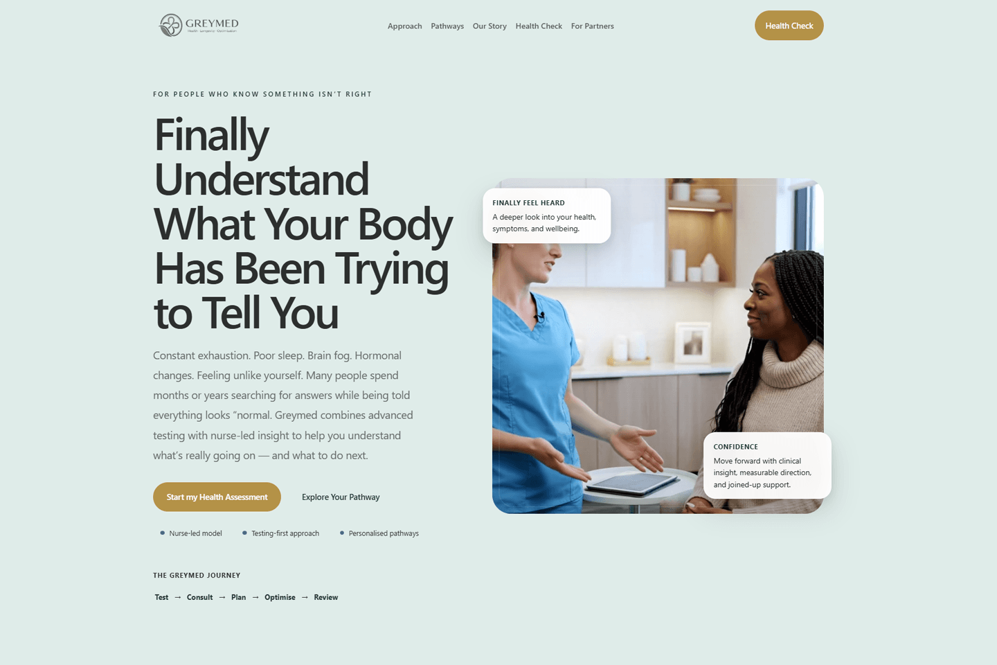
We designed and built Greymed's website, including a live health questionnaire and contact form. The client supplied the existing branding.
The starting point
Greymed needed a website that introduced the service and gave visitors a straightforward way to begin. The existing client branding set the visual direction; the task was to turn it into a usable website experience.
We focused the build on a clear route into the live health questionnaire, with a contact form available when a visitor needed to get in touch directly.
The brief in three parts
Give visitors a direct route to the live health questionnaire from the website.
Include a contact form for questions and follow-up conversations.
Apply the branding supplied by Greymed throughout the website build.
The organising idea
The site keeps the questionnaire and contact route visible, so a visitor can choose the next action without needing to work through a complicated navigation path.
Understand the service
Find the right information
Use the questionnaire
Start a conversation
What we shaped
The live questionnaire is treated as a clear next step within the website experience.
The contact form gives visitors an alternative way to get in touch from the site.
We used the supplied branding as the basis for the visual implementation.
The finished direction
The finished website brings Greymed's supplied branding, a live health questionnaire and a contact form together in one digital experience.
Verified delivery: website design and build, live health questionnaire, contact form and implementation of client-supplied branding.
Have a project in mind?
Tell us what you have now and what the website needs to help people understand or do more easily.